Contemporary Art 2018 – Synopsis Essay

(7/5)

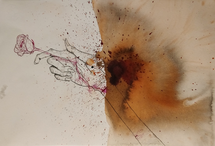
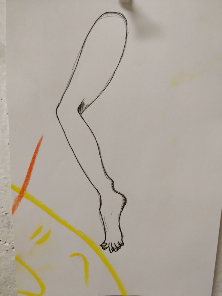
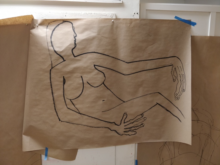
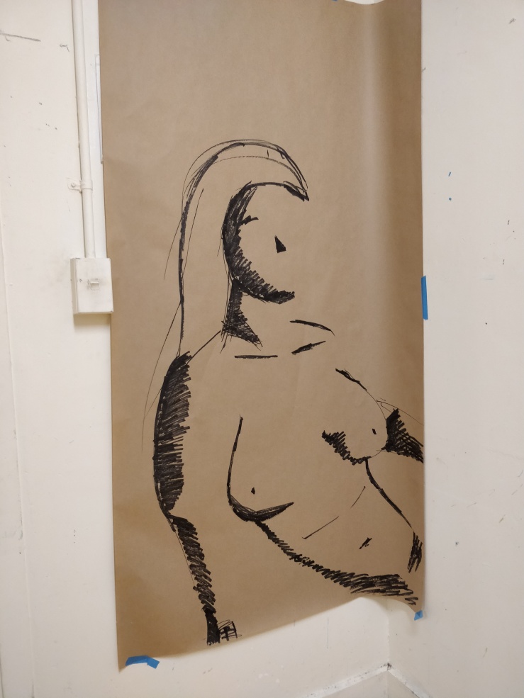
I came into contemporary arts practice to continue my life drawing class from the previous semester. I knew from the beginning that I would want to further improve my drawing skills from the previous semester. I also wanted to experiment with the figure style of Egon Schiele who would slightly exaggerate and extend the limbs and fingers of his forms, especially in his self-portraits. Equipped with this knowledge I started on my work.

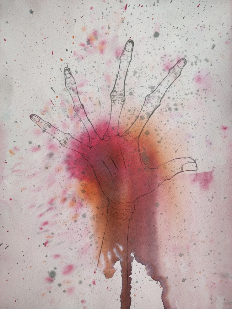
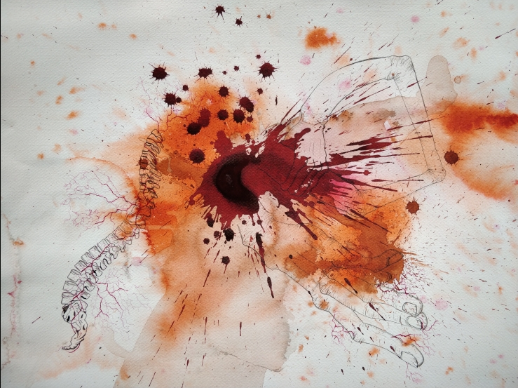
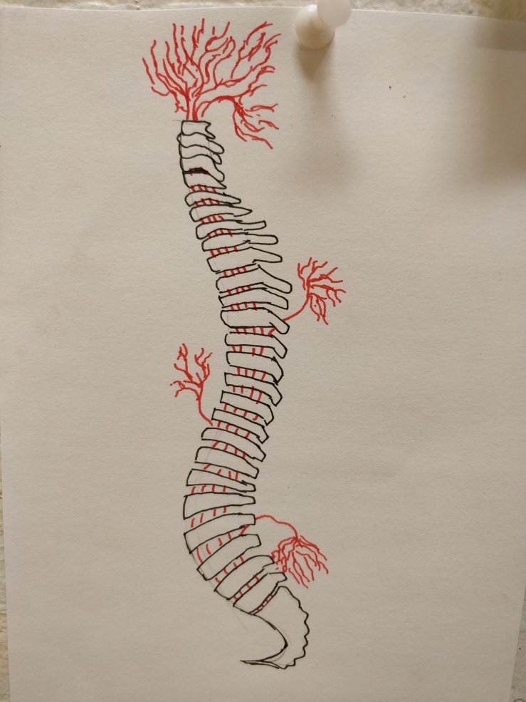
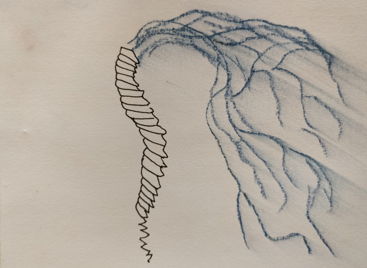
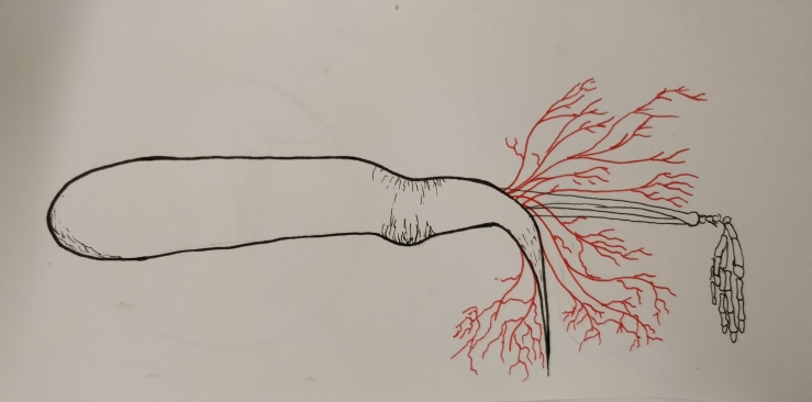
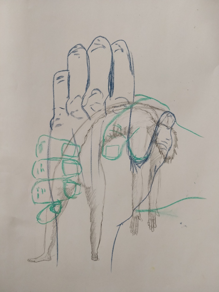
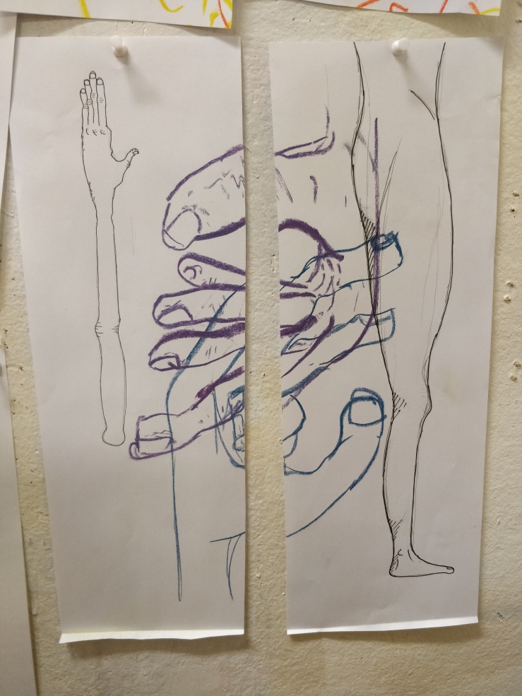
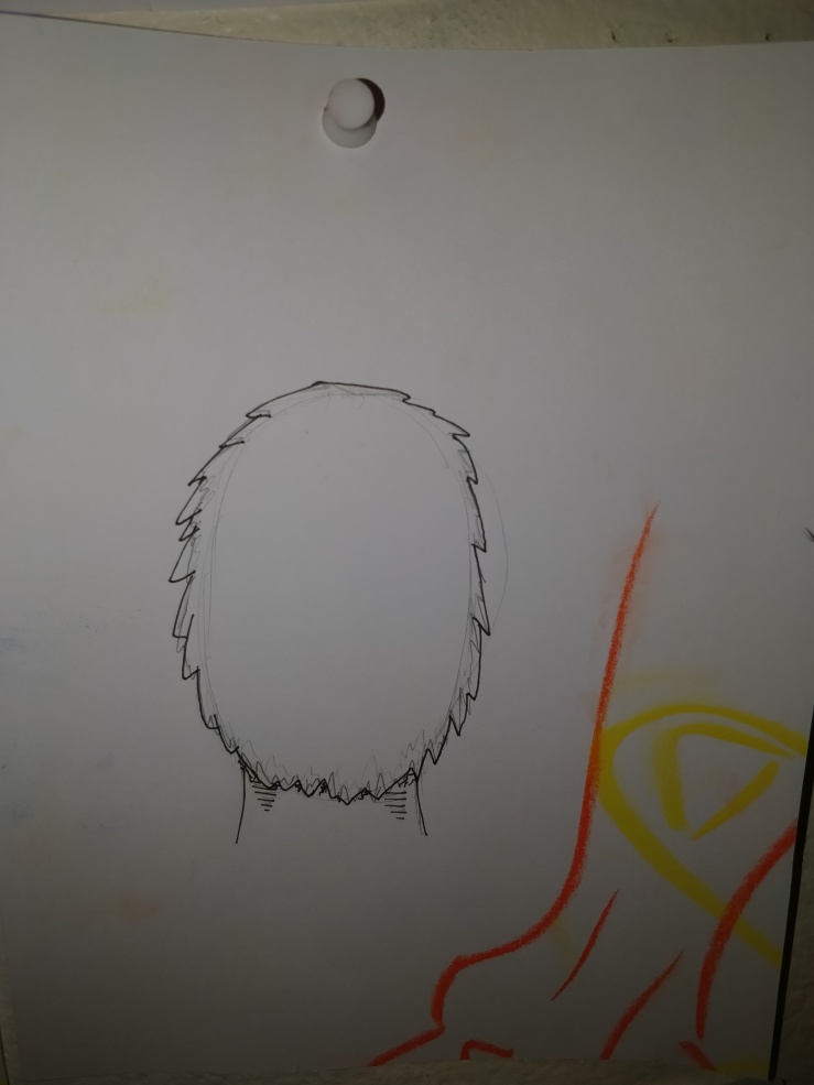
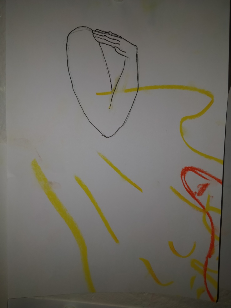
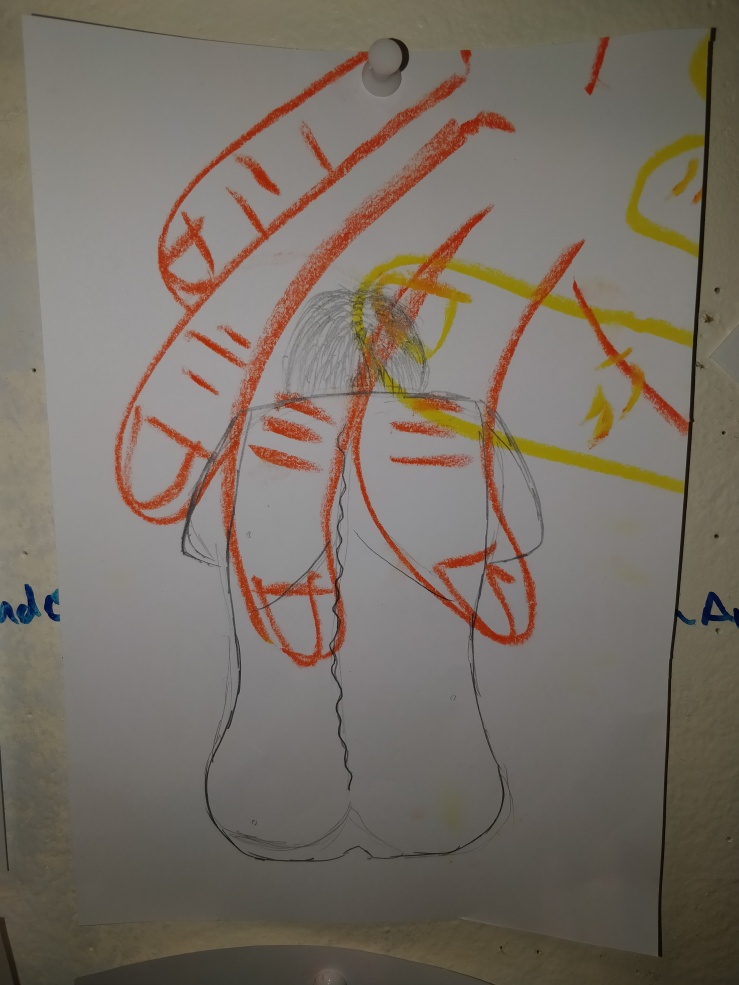
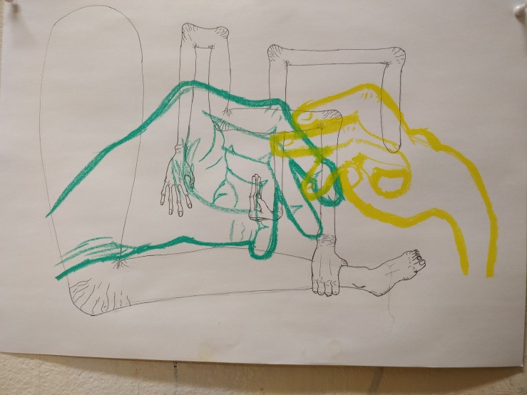
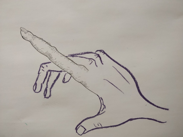
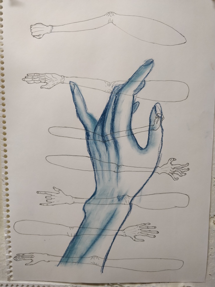
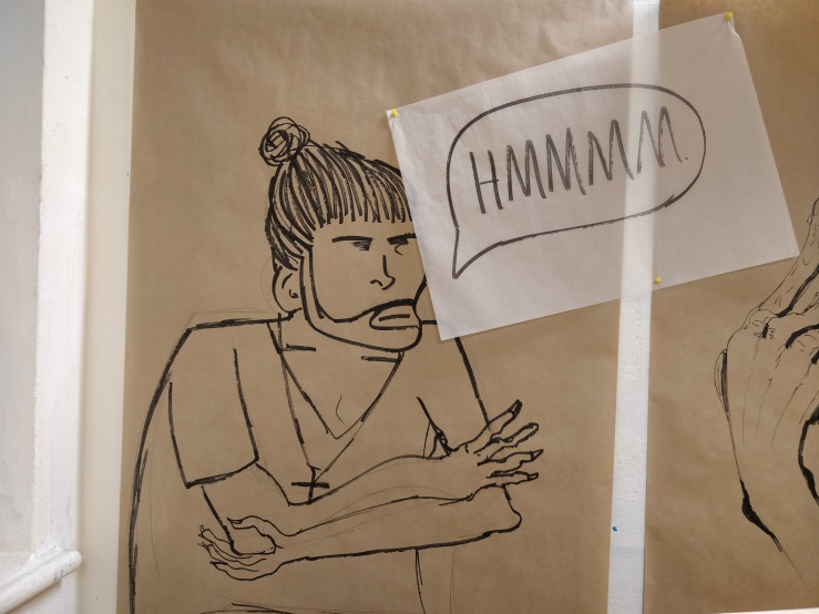
The first few pieces were reconstructions of previous works in the attempted style of Egon. These weren’t very successful until I got to the hand image, which led me down the path of grotesque mutated hands. As I honed my own drawing and style of hands, new ideas emerged and I introduced bloody veins similar to vines and other plant structures. The thought that sparked this was, “what if veins grew outside the body?” I applied this form to hands with cuts and the veins growing out and around them. This was also done to skulls and bones as I explored within the body as well.

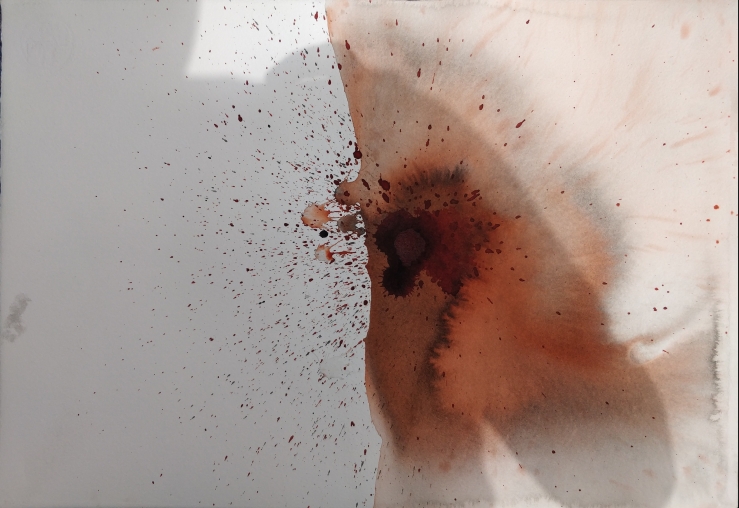
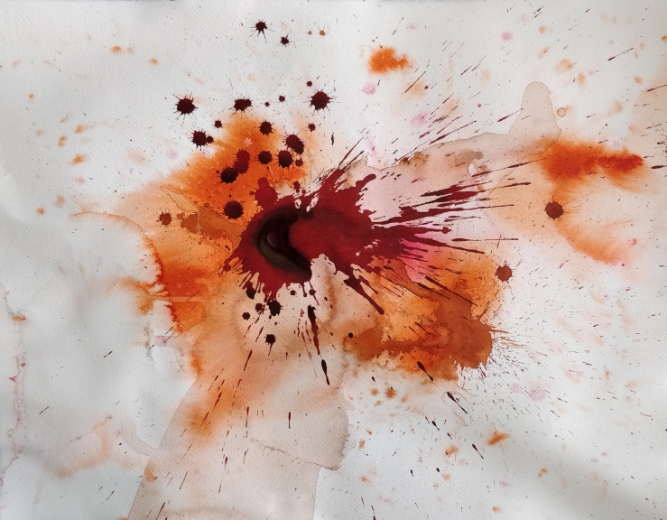
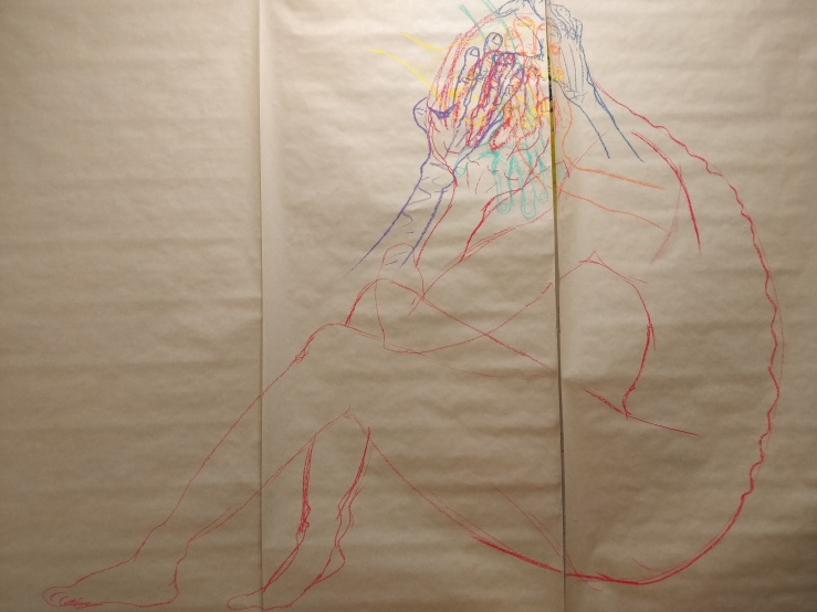
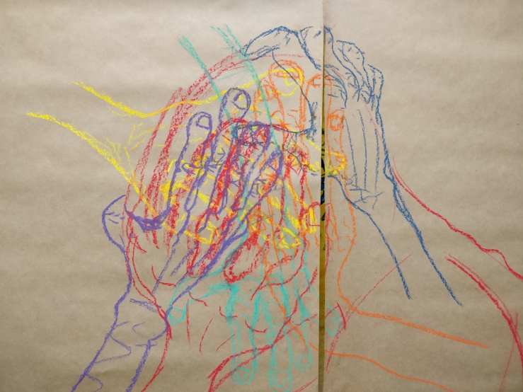
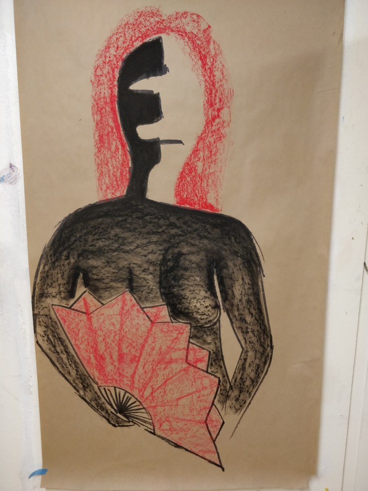
For my three final pieces I implemented an ink background which tried to mimic a bloody accident captured on a page, for example: Human organs appearing similar to my previous blood drawings. Similar imagery was dawn on top of the backgrounds using black and crimson inks. This was done to simulate a more raw drawing style using implements such a calligraphy nib which allows the ink to travel and spread in a more natural way rather than a pen that will create more consistent and uniform lines. This more natural look was also aided by the ink background as drawing on top of this will cause the ink to spread and blur.

This inconsistency is meant to reflect the human body in as much as no two of us are the same. As I looking back now on my work, there is an idea of mutation and evolution which is seen as a positive here. However very rarely do we see a mutation in humans as good and often calling the more visible ones a deformity that we must fix. Granted many do need to be fixed as they inhibit the quality of living of these people affected but not all require this. This negative connotation is probably due to the most common and most publicised mutation in humans, Cancer, which is a mutation of the cells that cause uncontrolled growth. This negative connotation has an irony to it as we are, as a species are a result of many mutations that have played a major part in human development.

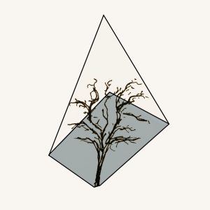
The inclusion of the vein plants was an attempt to pull humans out of the society that we have created and remind us that we are part of nature even though we don’t always feel like it. We’re just pretty smart animals. These vein plants suggest two things, firstly that we are part of a natural world and secondly our heavy use of plant matter in both our diets and as a building and crafting material. This has almost always been the case for us as it is ingrained in our DNA from our ancestors.

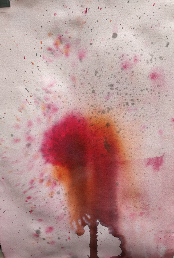
Red was used as the primary colour because of it direct association with blood. Of course red also indicates many feelings/emotions such as passion and rage which are all quite primal, that worked with the idea I was trying to present. Green could have been used as the veins to help closer associate with plant matter but ultimately was scrapped due to not providing the shock factor that red blood does. There was a thought that blue could have been used as arteries appear blue under the skin but ultimately I believed it wasn’t as strong a colour choice as red.

In a general sense my work attempts to explore the human race and what we are made up of physically and where we came from rather than emotional make up of a person. This is somewhat achieved but I still have a few more ideas and aspects that I would like to have had time to explore further, for example plant/trees mimicking the shapes of people which would explore the idea of how we have affected the environments around us and try and show how great of an impact we truly have.

Contemporary Art 2018 – Artist Research

(6/5)

This is the collected research for the artists that I was suggested to look at throughout the contemporary arts course.  This document consists of both painting analysis and opinion where I explain the images as I see them and say if I like what they have done or not.

Contemporary Art Artist Research

Contemporary Art 2018 – The last Push

(5/5)

The past two weeks I have been creating my final pieces as the due date for final submission rapidly approaches.

1.

IMG_20181107_132641
Background
IMG_20181107_210340
Finished work

This Image continues the theme of mutation and more specifically the plant like blood/veins exited wounds that can be seen in some of the smaller images.

2.

IMG_20181107_143720
Background
IMG_20181108_175718
Finished Work

This piece I think is the least successful of the three. I feel the that the line work gets lost in the background image. The lines also get blurred from using ink on top of ink.

3.

IMG_20181107_150841
Background
IMG_20181108_175659
Finished Work

This is the largest of the three pieces, being approximately A2 in size. I think that this piece is the best of the three. From a distance the splattering draws you in and reveals firstly the spine then the hand and lastly the arm.

Contemporary Art 2018 – Mutation

(4/5)

I pretty much continued from where I left off in the idea, giving organs another go with two drawings of lungs. One of the pair of lungs looked kind of leafy but really was to ambiguous to know that. They turn out alright but didn’t push the idea forward any further, As a side drawing to mix things up they work fine. I also continued with bone drawings with a skull and “bone shoot”. The “bone shoot” in particular gave the clearest indication so far that I was trying to create a plant like structure as the veins grow out of it from the ground like a plant.

Ultimately this batch of drawings was a good continuation of the idea, They did however become a little repetitive by the end. Knowing this means I would have to introduce a major new element to the last few pieces I create this year.

Contemporary Art 2018 – Addition

(3/5)

After experimenting with the thick and thin contrast drawing. I started by continuing with the hands I had started but without the pastels. The goal here was to improve my drawing skill as well as adding things to my drawings. I tried continuing an idea of   adding unnecessary joints to arms and fingers which gave a creepy mutant feel sort of reminiscent Frankenstein with wrong and mismatched proportions along with some extras.

Throughout this batch of drawing I wanted to see what was going on within these limbs and there bodies so I started to experiment with internal body structures and organs. The organs didn’t go very far stopping at a heart. But when trying to draw the vein structure of a hand, I kept wondering how it could grow outside the body. Then came a series of three drawings two spines and peeled arm. These images would propel my theme into the next stage.

IMG_20181105_104911IMG_20181105_104921IMG_20181105_105845

Contemporary Art 2018 -The Extendables

(2/5)

The Extendables is designed to extend on what we had done during the previous 4ish weeks. Initially I just continued from where I left off. This being the best piece.

IMG_20180917_115807IMG_20180917_115830

Afterwards I was then Instructed to switch things up and scale was suggested, so from Large 1m-3m Images I then went to A3 to and even smaller. I also tried refining my mark making experimenting with fine-liner pens, going from large chalk pastels to 0.3mm to 0.05mm thin pen lines.I didn’t want to abandon the previous works though so I tried to integrate large hand on to these smaller drawings with the pastel to keep a kind of continuity between the works/thinking. I also briefly experimented with cutting the images and using portions of a larger drawing.

IMG_20181105_104703IMG_20181105_104755IMG_20181105_104738IMG_20181105_104728IMG_20181105_104720IMG_20181105_104711IMG_20181105_104803IMG_20181105_104830IMG_20181105_104553


I think the final two pieces, (The blue hand and the purple hand) were my most successful pieces in theses couple of weeks. I think the contrast works nicely between the super thin marker line and the much thicker pastel lines. I also experimented with different detail levels for the two images with the ultra detailed finger and minimal hand as well as rather simple arms underneath a nicely shaded hand. I concluded that I preferred the more detailed purple hand and finger and elected to continue with that kind of style.

Contemporary Art 2018 – The Expandables

(1/5)

At the beginning of this class we were tasked to choose something from semester one of this year and expand upon it. I choose the Life Drawing class ,which I thoroughly enjoyed, to continue. The only real things I knew i wanted to do were to Continue to improve my drawing skill and to begin with an artist that I was only introduced to at the end of the last semester, Egon Schiele.

The first few week were mainly comprise of research and exploration and would ultimately conclude with a presentation of what we have learned  and what we intend to do later in the semester as a final submission for this elective.

In my creating I went large with my drawings on a brown paper. I tried to emulated  Schieles sort of style with his exaggeration of the figure stretching hand and fingers out mainly. I drew and redrew both new and old drawings (originally from life drawing).

IMG_20180815_144009IMG_20180815_144100IMG_20180808_155755IMG_20180808_155735

IMG_20180808_155801

At the end of the three weeks that was The Expandables, I presented a slide show which wasn’t the greatest. The goal of this presentation was to propose a project for the next part of this elective. During the discussion that followed it was worked out that I would create and present a body of work. later I decided I would also present a series of 3 “complete” or “finished” pieces.

Presentation: Liam Tanner Formative


Time Scape

Here is my Timeline for Cameras, Batman and Lego.Timeline

pdf version-Timeline

Bibliography

“Batman Publication History.” Wikia.com, dc.wikia.com/wiki/Batman_Publication_History

“Batman: History.” UBC, ultimatebatmancomicswebsite.weebly.com/batman-history.html.

“Batman.” Comic Zine, comicvine.gamespot.com/batman/4005-1699/.


The Lego History Timeline.” Lego.com, www.lego.com/en-us/aboutus/lego-group/the_lego_history.

www.youtube.com/watch?v=NdDU_BBJW9Y.

“The Early History of LEGO.” Mental Floss, mentalfloss.com/article/19400/early-history-lego.


“History of Cameras: Illustrated Timeline.” Photodoto, photodoto.com/camera-history-timeline/.

Bellis, Mary. “The History of Photography: Pinholes and Polaroids to Digital Images .” ThoughtCO., http://www.thoughtco.com/history-of-photography-and-the-camera-1992331.

Durable Record

My Scape Project has altered many times from the original concept that was presented many weeks ago. Initially the project was to consist of nine A2 posters containing photographic, illustration and graphic design practices, now its ten A2 posters consisting of five photography based designs and five graphic designs. During the presentation I claimed I would do up to 100 different designs and variations to achieve the best possible result, and I managed to create 84 different designs/variations throughout the semester. This number is obviously under my goal however I was aggressive in my estimates to push myself to get the best possible variation of designs.

I went into this project with a few artist and designers in mind that I wanted to use as an influences such as Josef Muller Brockmann. Brockmann’s influence can be seen in the graphic design portion of my project as I use full page colours as he did in some of his works. My colour choice however is not as vibrant as what Brockmann tends to use when he uses colour.  The simplicity of my designs are somewhat similar to a few of Brockmanns designs such as the Der Film poster.

Der Film (1960), Josef Müller-Brockmann

Idris Khan is a photographer who takes multiple pictures of the same building or silo and overlays them on top of each other but not exactly straight over creating a blurred effect revealing the basic outline. These shapes are emphasised by the images being black and white as the contrast helps make the images clearer. One of the features of khan’s work I found fascinating is the overlaying of the same object on top of itself to the point it starts to distort the original shape. You can see this in my graphic design flowers where I draw over the outline of the petals and place them a skew from the colour.

Spiral Gasholder… a homage Bernd Becher (2007), digital print, 61 x 50.8cm

Another artist I used elements from was Alexey Bogolepov, who is a photographer who takes monochrome pictures of industrial building, where in one series he had illustrated red lines on top of these images. I really like the slightly miss aligned line work.  These illustration heavily influenced the series of graphic design flowers that I did where I off set a white outline of the petals and leaves from the colour. At the start I had copied his style directly by doing the outline straight over the image of the flower but discovered that it looked more interesting when the images itself was removed and replaced with simplistic colours. I then developed the shape of the flower and petals to be more geometric to create the current design. Numerous colour combinations were tested and the finals were picked form eight different options. I decided that the backgrounds should stay consistent to have some continuity between the whole series as well as the overall style.

Alexey Bogolepov

Alexey Bogolepov also influenced my photography series as well.  I liked the extreme contrast being used in Bogolepov’s images and wanted to mimic that on some level. I also like the ability to draw on top of these images. Unlike Bogolepov in these images however I wanted to keep the beautiful colour I was capturing so I merged the two ideas. Having a portion of my image being monochrome carries the style from Bogolepov but the geometric shape with the coloured continuation of the image inside. With my composition I have achieved another contrast between the colourized portion of my image and the monochrome portion that allows the audience to focus on the centre of picture.

The reason I chose Oakley Creek as my site was due to its unique beauty primarily when you go off the regular pathway. The natural formations created from bolder movement or the collapse of a tree can be spectacular. Oakley Creek also has a strong community supporting the continued maintenance of the site; Oakley Creek and Friends. This community group works with local primary schools and by themselves to revitalise the whole area by planting many native trees in the weekends. This level of commitment and love for an area inspired me to do my best when creating my poster and designs.

Pdf-Durable Record

Shape: Reflection

The Shape of Things has influenced my Creativity and Design work by reinforcing and developing my ability to iterate existing ideas. As my work in creativity and Design is based in Graphic Design and Photography I had a firm grasp of the basic concept of iteration. This five week course enhanced these skills to the point that I think I would be very capable of being given a brief and then developing a concept from almost nothing. This is due to the creative guide I have developed for myself that has been coaxed and nurtured with the learning I have undertaken throughout this year and in particular this semester.

My practice is situated firmly in graphic design with interests stretching out into both illustration and photography. Within graphic design iteration is a crucial focus as it is how the best design starts. This is true for all practices but most of all for graphic design as it is not uncommon to have 100+ different iterations for a single project or poster. These excessive numbers can be even higher with the influence of financial considerations involved in a professional practice.

My iterations usually involve changing of colour, size or orientation however, now I’m thinking of using different textures and material that I could substitute for plain colours such as using a rocky or concrete texture to provide more depth and variety to my designs. This in turn will allow me to create a larger scope for these designs instead of my current limited possibilities. This realisation has acted as a filter funnel of sorts where my previous options were somewhat narrow but now have widened and will allow me to produce better quality work.

Within this course I’ve gained an appreciation of 3D art and sculpture as I had limited interest in it previously but now I’m quite open to the concept of working more with clay. I enjoy the mould ability of clay and the ease of it to be reshaped into different forms using tools, moulds or my hands. I enjoyed the tactile feel of moulding directly with my own hands rather than having to use machines with other harder materials. I hope to use these 3D forms and integrate them into my existing practice combining both into quite a unique concept and possibly series of art pieces.

I didn’t like making things out of wood. I felt that it was a lot slower and that you didn’t have anywhere near the flexibility that clay had. I do appreciate the extreme accuracy wood can provide unlike the limitation of clay where you can only get so far with your hands and tools. Wood and clay both provide a permanent form but after the clay has been fired this fixed form is therefore more permanent than the wood as the clay turns to “stone”. When working with these very rigid materials I have a kind of anxiety of not being able to go back or that that it will be time consuming to have to repeat creating the wooden model but with clay I am able to almost instantly fix a mistake. Very rarely do you have to completely restart a part when working with clay as opposed wood where you either start again or try to glue your mistake back together and wait a day to see if it actually worked.

Foam was similar to wood, however, it was significantly faster and easier to work with. I still felt my anxiety but it was lessened as the time invested wasn’t as significant as it would be working in wood. Wire was also similar but in the way of speed and workability because you could “mould” the wire by hand similar to clay. The soldering process was also a moulding process which I was very comfortable with when using the soldering iron. Previously I had done a little electronic soldering but now I can do both.

Overall I enjoy the class as well as the exploration it afforded me, especially to do with the different materials and forms I now have access to. I hope in the future I will be able to use these with more confidence in projects. It has been a great learning curve and surprised me with how much I enjoyed using different materials, a highlight being my experience with clay and I hope I will have an opportunity next year to revisit it.