Time Scape

Here is my Timeline for Cameras, Batman and Lego.Timeline

pdf version-Timeline

Bibliography

“Batman Publication History.” Wikia.com, dc.wikia.com/wiki/Batman_Publication_History

“Batman: History.” UBC, ultimatebatmancomicswebsite.weebly.com/batman-history.html.

“Batman.” Comic Zine, comicvine.gamespot.com/batman/4005-1699/.


The Lego History Timeline.” Lego.com, www.lego.com/en-us/aboutus/lego-group/the_lego_history.

www.youtube.com/watch?v=NdDU_BBJW9Y.

“The Early History of LEGO.” Mental Floss, mentalfloss.com/article/19400/early-history-lego.


“History of Cameras: Illustrated Timeline.” Photodoto, photodoto.com/camera-history-timeline/.

Bellis, Mary. “The History of Photography: Pinholes and Polaroids to Digital Images .” ThoughtCO., http://www.thoughtco.com/history-of-photography-and-the-camera-1992331.

Durable Record

My Scape Project has altered many times from the original concept that was presented many weeks ago. Initially the project was to consist of nine A2 posters containing photographic, illustration and graphic design practices, now its ten A2 posters consisting of five photography based designs and five graphic designs. During the presentation I claimed I would do up to 100 different designs and variations to achieve the best possible result, and I managed to create 84 different designs/variations throughout the semester. This number is obviously under my goal however I was aggressive in my estimates to push myself to get the best possible variation of designs.

I went into this project with a few artist and designers in mind that I wanted to use as an influences such as Josef Muller Brockmann. Brockmann’s influence can be seen in the graphic design portion of my project as I use full page colours as he did in some of his works. My colour choice however is not as vibrant as what Brockmann tends to use when he uses colour.  The simplicity of my designs are somewhat similar to a few of Brockmanns designs such as the Der Film poster.

Der Film (1960), Josef Müller-Brockmann

Idris Khan is a photographer who takes multiple pictures of the same building or silo and overlays them on top of each other but not exactly straight over creating a blurred effect revealing the basic outline. These shapes are emphasised by the images being black and white as the contrast helps make the images clearer. One of the features of khan’s work I found fascinating is the overlaying of the same object on top of itself to the point it starts to distort the original shape. You can see this in my graphic design flowers where I draw over the outline of the petals and place them a skew from the colour.

Spiral Gasholder… a homage Bernd Becher (2007), digital print, 61 x 50.8cm

Another artist I used elements from was Alexey Bogolepov, who is a photographer who takes monochrome pictures of industrial building, where in one series he had illustrated red lines on top of these images. I really like the slightly miss aligned line work.  These illustration heavily influenced the series of graphic design flowers that I did where I off set a white outline of the petals and leaves from the colour. At the start I had copied his style directly by doing the outline straight over the image of the flower but discovered that it looked more interesting when the images itself was removed and replaced with simplistic colours. I then developed the shape of the flower and petals to be more geometric to create the current design. Numerous colour combinations were tested and the finals were picked form eight different options. I decided that the backgrounds should stay consistent to have some continuity between the whole series as well as the overall style.

Alexey Bogolepov

Alexey Bogolepov also influenced my photography series as well.  I liked the extreme contrast being used in Bogolepov’s images and wanted to mimic that on some level. I also like the ability to draw on top of these images. Unlike Bogolepov in these images however I wanted to keep the beautiful colour I was capturing so I merged the two ideas. Having a portion of my image being monochrome carries the style from Bogolepov but the geometric shape with the coloured continuation of the image inside. With my composition I have achieved another contrast between the colourized portion of my image and the monochrome portion that allows the audience to focus on the centre of picture.

The reason I chose Oakley Creek as my site was due to its unique beauty primarily when you go off the regular pathway. The natural formations created from bolder movement or the collapse of a tree can be spectacular. Oakley Creek also has a strong community supporting the continued maintenance of the site; Oakley Creek and Friends. This community group works with local primary schools and by themselves to revitalise the whole area by planting many native trees in the weekends. This level of commitment and love for an area inspired me to do my best when creating my poster and designs.

Pdf-Durable Record

Framed Beginnings

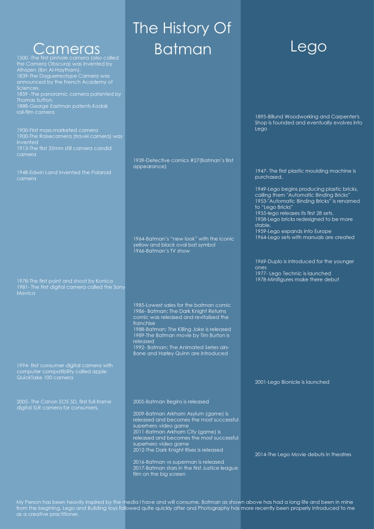
How artist place there work according to a context or others in there practice is an important task that can be difficult to some. This framing can be done through there surrounding, time, emotions, events, friends and family.

William Bardebes is a Graphic designer and Unitec lecturer who during a presentation revealed to us that his childhood played a large part on where he is today. He described in great detail how he would prefer the ads in the backs of comic books rather than the actual stories of superhero as the outlandish ads where more grounded in reality.  This was the first memorable interaction of graphic design for William and where William discovered the art of having something to say and saying it. During this time the news was flooded with the Vietnam War and with plenty of people who have something to say. William also talked about significant designers during his early years such as David Carson and specifically with his work with the magazine Ray Gun. William transition to how the work that once inspired him now looks ridiculous and dated, He came to the conclusion that “Style = Fart”.

Emma Smith’s is a Unitec lecturer and Painter. Emma’s work is also deeply entangled with her childhood and the fond memories of such a time.  Emma’s first artist influence was from a book by Emil Nolde that she got at an early age and challenged her child like perspective on art. Emma describes the art as really bright and muddy at the same time. Although this was Emma’s first meaningful interaction with art, it does not define her work now nor does it play a small part if at all. Unlike some artist Emma’s work is not imbued with a message or meaning but is influenced through architecture and industrial supplies possibly influenced by the childish memories of playing in an abandoned plot of land used by road workers to store their broken/unused supplies. This industrial influence is obvious and prevalent in Emma’s work with the use of straight lines and the repeated pole like shape as well as the support like structures.

Carston Kudra is film maker, editor and Unitec lecturer .Carstons accounts his creativity to his early years where he played Role playing games such as Dungeons and Dragons. These game rely on a great amount of creativity and improv. as the Dungeon Master. The Dungeon Master creates everything from a world and interactions for the player(s) to the evil that may plague the land.  Although Dungeons and Dragons isn’t feature in any of Carston’s work the skills of quick and creative problem solving are greatly desired anywhere and even more so in a creative industry. Carston’s work as a film maker helps express his creativity but with such an influx of creativity the out let is this game.

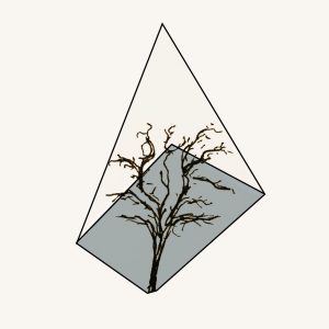
My inspirations come from a variety of places. One of which is a set of Owl prints by Amie Samla called “wise owl” I got as a gift a long time ago as well as a more recent addition of “Fly Tui II” by Daniel Tippet which I got For my 18th Birthday. These are black, white and have crisp lines. Which I like and have replicated in my design and illustration work. Another place I draw inspiration from is koraha reserve. I walk through this park each day to get home and I find it relaxing with beautiful greenery and interesting shapes. The third place I draw creativity from is all things comic books, the stories, the tie-in movies, the collectables but especially the making of comic books. I am fascinated with the line art and inking process within the comic book creation world.

These Inspirations are the most obvious to me but I am sure there are many more lying beneath the surface that every so often appear, The inspirations that I haven’t Identified myself and maybe never will.